
3D CSS boxes and Physics with Cannon.js
4th Jun 2013
I've been doing a fair amount of creative and 3d programming recently. One major drawback of using something like WebGL at the moment is that it isn't natively supported on many mobile devices and falling back to something like the Three.js canvas 2d renderer is very slow.
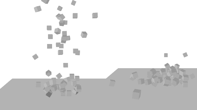
So I've been playing around with using CSS 3D transforms to see what you can achieve. Here's an example of a simple scene showing boxes being dropped on to a plane (Click the window to drop them).
<iframe src="https://davetayls.me/teststation/css3/boxes/physics.html" width="100%" height="500"> <a href="https://davetayls.me/teststation/css3/boxes/physics.html">View it</a> </iframe>I was able to use Cannon.js for the physics engine. Unfortunately the phone couldn't cope with the physics as well so here is a simple version which runs well on a phone
Building
David Desandro has done a really good intro to 3D transforms if you haven't taken a look yet.
The Box / Cube
I managed to simplify the markup down to a container and a couple of inner elements.
<div class="box">
  <i class="front"></i>
  <i class="back"></i>
</div>
The main box has a fixed height and starts in the middle of the page
so that translate3d(0,0,0) is the center of the page.
.box {
  display: block;
  width: 14px;
  height: 14px;
  position: absolute;
  top: 50%;
  left: 50%;
  margin-left: -7px;
  margin-top: -7px;
  transform-style: preserve-3d;
}
I created the extra sides of the cube from the :before and :after
selectors instead of using more elements. You can do this as long as you
don't need to apply CSS transitions to them which we don't in this
case.
.box i:before,
.box i:after,
.box i {
  display: block;
  background: #999;
  width: 14px;
  height: 14px;
  position: absolute;
  top: 0;
  left: 0;
  transform-style: preserve-3d; }

.box i:after,
.box i:before {
  content: ""; }
It then rotates and translates the individual faces to form the sides of the cube.
.box .front {
  transform: rotateX(90deg) translateZ(7px); }
  .box .front:before {
    transform: translateZ(-14px); }
  .box .front:after {
    transform:
      rotateY(90deg)
      translateZ(7px)
      translateX(7px); }

.box i.back {
  transform: rotateY(0deg) translateZ(7px);
  background: #aaa; }
  .box i.back:before {
    transform: translateZ(-14px);
    background: #ccc; }
  .box i.back:after {
    transform:
      rotateY(90deg)
      translateZ(-7px)
      translateX(7px);
    background: #bbb; }
We now have a reusable box to add to our scene.
Applying some physics
The next task is to apply the Cannon.js physics engine to our boxes. It has an API reminiscent of Three.js as it has been inspired by it. All the examples on the homepage are using Three.js but it can be used independently.
First we set up our world and specify how much gravity it has.
var world = new CANNON.World();
world.gravity.set(0,0,-90.82);
world.broadphase = new CANNON.NaiveBroadphase();
We then can place a plane to act as the ground and cause the boxes to bounce and eventually come to rest on it.
var groundShape = new CANNON.Plane();
var groundMat   = new CANNON.Material();
var groundBody = new CANNON.RigidBody(0,groundShape, groundMat);
world.add(groundBody);
Then during the creation of the a box we define a new shape and describe how it's material will react when it comes in to contact with the ground material.
var shape = new CANNON.Box(new CANNON.Vec3(10,10,6));
var mat   = new CANNON.Material();
this.body = new CANNON.RigidBody(0.1, shape, mat);
this.body.linearDamping = 0.1;
world.add(this.body);
Defining a CANNON.ContactMaterial sets up the relationship where we
pass in the two materials, then how much friction the surface has and
finally the restitution which affects how bouncy it is.
var mat_ground = new CANNON.ContactMaterial(groundMat, mat, 0.5, 0.2);
world.addContactMaterial(mat_ground);
Frames
Finally in the animation loop we tell the world to calculate positions at it's next step.
world.step(1.0/60.0);
... we update the positions of all the boxes and update the relevant CSS properties on the box.
Box.prototype = {
  render: function(){
    var pos = 'translate3d('+ [
          this.body.position.x,
          this.body.position.z*-1,
          this.body.position.y
      ].join('px,') +'px)',
      rot = 'rotate3d('+ [
          this.body.quaternion.x,
          this.body.quaternion.y,
          this.body.quaternion.z
          ].join(',') +', '+ this.body.quaternion.w +'rad)'
    ;
    this.el.style[Modernizr.prefixed('transform')] = pos +' '+ rot;
  }
};
Notice that in the CSS coordinate system the Z axis goes from font to back whereas CANNON seems to expect the Z axis to go up to down. This means that I use the body's Z position (reversed) in the CSS Y axis.
That's about it
Take a look at the code if you want to see the specifics. This is the first time I've used Cannon.js so I welcome any corrections.