
Pure Components. Creating stable, testable UI we can rely on
21st Jun 2016
We have seen the huge benefits of pure functions for creating high quality and testable JavaScript. I’ve been applying the same understanding to UI components for a while now and am seeing these same benefits. It’s useful to take a look at what makes a “pure component” and how we can change the way we build websites to realise these benefits.
A “pure function” is a function that satisfies two conditions:
- The outcome is always the same given that the input is the same
- Evaluation of the result does not cause any external side effects
These two restrictions are simple but very powerful. Let’s consider how they might impact the building of frontend code.
- They allow us to have concrete expectations given a particular set of values. This means we can test them more thoroughly
- We can build these components in isolation which helps when scaling the team or outsourcing development
- We can easily test our expectations in a theoretical world or state. This means that we can test the same component as it changes based on user input or choices
- We can generate as many instances of a component, place it into a browser knowing that it won’t affect the functionality of anything else running at the same time
- We can easily build or render components in parallel. This gives us new possibilities as apps scale. Workers are going to become more and more common as the complexity and the load on the browser increases. Pure Components allow parallelism from the start
- Tools that test pixel changes across releases can be used to a greater degree of accuracy reducing visual regressions! This is one of the hardest things to get right for any large website
Given these benefits you are right to be asking where do we begin? For this we must form a close relationship between the UX, Design and Build stages of the project. I’ve been pleased to see that this kind of thinking is becoming more and more prevalent from the planning stages so you might find that this is easier than you think.
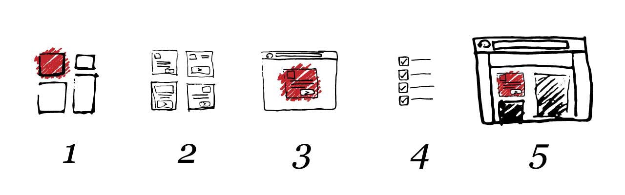
We need to start with this simple 5 step process:
Focus on Small Pieces of UI

Clients like to visualize the journey so naturally full page mock-ups will be needed to make sure the overall experience is right.
The mistake comes when you allow the client to stay in this mentality and not help them understand the big picture: building consistent elements that will be used across the site. When we take the client through the designs we should be showing them the pieces that make up the page they see in front of them. In turn this practice will help the UX and design team to be disciplined in the way they put the pages together.
Let’s take a person’s profile badge as a simple example. You might get a design laid out a little like this
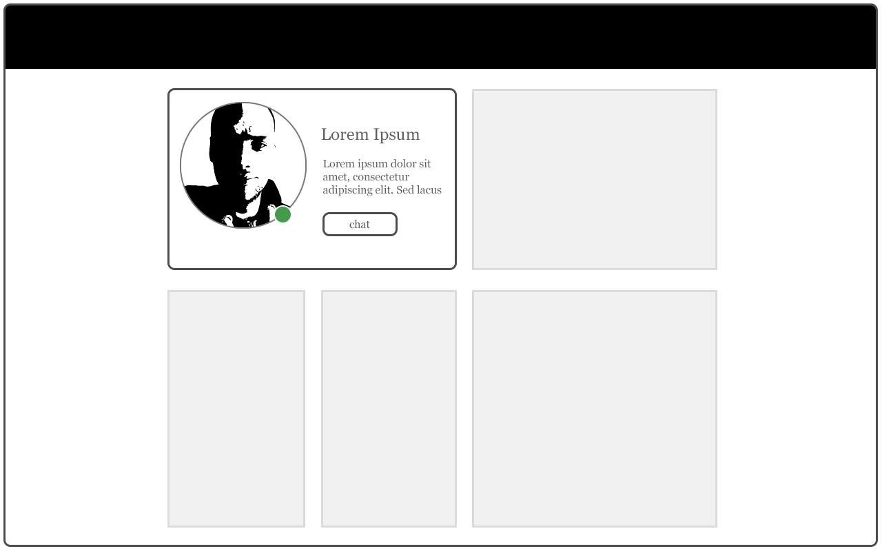
- This badge might appear on an article the person has written.
- It might also appear in a listing of people who have written articles.
- It might appear as a “featured person” on a landing page
The badge doesn’t necessarily need to be the exact same size, it could fit to a container and be responsive.
Decide and Document Small Variations or State Changes
Once the site has been split into small pieces, you will be able to see where improvements can be made to consistency. You will start to see these benefits already. It will reduce the amount of duplication by finding similar pieces of UI and combining them into fewer variations. By having fewer variations your assets will be lighter and you will find that your website will perform better.
At this stage you should decide on each component’s variations and document their behavior. We identified in the previous step that the site was displaying a person’s profile information. Now we are going to consider how it might vary slightly. We look across the requirements and then design and document these variations in it’s state:
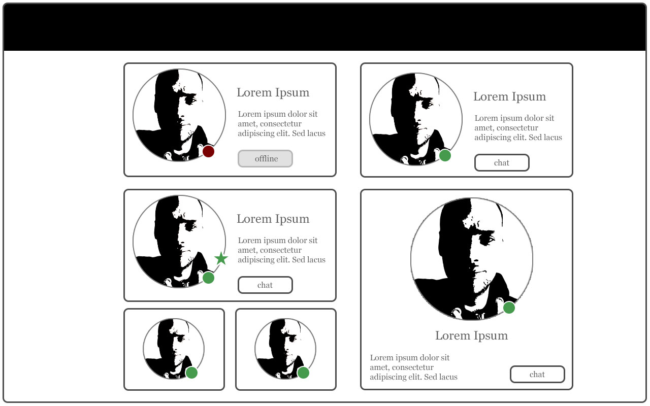
- Person is offline (design might show greyed out dot and a status message might say “offline”)
- Person is online (design might show a green dot and a status message might say “online”)
- Person is an expert (design might show a star icon)
- A compact version which could be used in a grid
- Large variation where the person’s picture stands out more (this might be useful on landing pages)
The trick here is not to make a component have too many variations. The rule of thumb is that it should perform a single core role much like the Single Responsibility Principle describes for programming.
Build the Component in Isolation

We’re now ready to build. There is often a real struggle with Agile builds because they expect the work to be nicely sliced up into sprints. Often in the past I have been presented with a few pages to complete in a sprint. This way of working has hardly ever been successful because of all the dependencies that go into a full page. Building components in isolation fits into this process beautifully, it is much easier to predict and much easier to see progress. Also as we have seen with Test Driven Development, focusing on a simpler task and getting it right is more productive and less prone to errors.
Set out the structure of your project so that these components are separated. I recommend keeping related assets inside the same folder. A structure like this is usually a safe place to start from:
/MyProject
    /components
        /ProfileBadge
            ProfileBadgeComponent.(hbs,jsx,cshtml,erb...)
        /HeroBanner
        /CookieBar
Next it’s a case of writing the code needed to build the internal elements of this component. This might be a case of html inside a templating system or JavaScript views/components in the browser.
Here is a simple example using JSX to illustrate the idea.
function ProfileBadge(props) {
  let chatButton;
  if (props.isOnline) {
    chatButton = (<a className="ProfileBadge__chatButton" href="{props.profileChatUrl}">{props.onlineButtonText}</a>);
  } else {
    chatButton = (<span className="ProfileBadge__chatButton">{props.offlineButtonText}</span>);
  }
  return (
    <section className="ProfileBadge {(props.isOnline ? 'ProfileBadge--isOnline': '')}">
      <div className="ProfileBadge__avatar">
        <img src="{props.avatarSrc}" />
      </div>
      <span class="ProfileBadge__statusIndicator"></span>
      <h1 className="ProfileBadge__profileName">{props.profileName}</h1>
      <p className="ProfileBadge__description">{props.description}</p>
      <chatButton />
    </section>
  );
}
Take this template and based on the variations we documented in the previous step, send the data each needs and display them all on a single page. So to clarify, you'll have a single pure component template and 5 examples on this page.
At this point you will want to complete the styling and any dynamic interactions.
Test Expectations For Each Variation or State Change

Here’s the part which often gets nicely forgotten because it’s hard testing UI. Having pure components however, components which are predictable, components where you can have clear expectations and control make this process so much simpler. This is a big topic, but here is a suggestion to make a start.
We should now have a page which includes all the variations in different for each component. You can use these pages as part of your manual checks to make sure nothing is being broken.
When you are confident enough you can then include them in visual test suites. Given a particular browser width these pages should not see any pixel change between releases (unless expected of course). I recommend looking at PhantomCSS to help you with this process.
Whatever path you take, the point here is that because of the path we have taken we now have a set of pages which should conform to a pre-defined set of expectations.
Include in Your Site

Your final job is to glue the components together with an underlying state. If this is a server-side component render the HTML inside containers (often grids) within the larger page structure. If you’re building a dynamic app then it’s more likely to be a case of appending a root element into a containing element within the DOM.
You will at times need to update the component as a result of changes in your data. Depending on the technology stack and how this component will be used this could mean rendering the appropriate HTML or if it is part of a dynamic app it’s usually more performant to manipulate the specific elements that change in the DOM, filling each component with the information it is allowed to hold and telling it which variation is currently needed.
Here is a simple example of how this might look:
function getProductPage() {
  return (
    <PageHeader />
    <div className="row">
      <div className="col-6">
        <ProfileBadge
          isOnline={false}
          avatarSrc="/images/avatar.jpg"
          profileName="Bob"
          description="A great conversationalist"
          offlineButtonText="offline"
        />
      </div>
      <div className="col-6">
        <ProductInfo ...productInfoData />
      </div>
    </div>
  );
}
I’ve deliberately been slightly vague here because. It’s often easy to use current trends to demonstrate these concepts. These steps however have time and time again proven to work across numerous technology stacks, even if the exact methods have changed.
In my time as a developer and a frontend architect I want to learn and solidify the techniques that don’t change, the ones that often underpin all of the frameworks that come and go. This has helped me embrace an ever changing landscape and not shy away from it due to exhaustion.
Take these 5 steps, look at how they fit into your team’s processes. You’ll be on your way to a more maintainable and testable codebase.